A branch of mathematics utilized in multiple criterion decision-making, the multi-objective optimization problem (also known as multi-objective programming problem), deals with optimization issues where two or more objective functions must be optimized simultaneously.
Here the Pareto Frontier, a graphical tool used in multi-objective optimization to find the best trade-off between multiple conflicting objectives, this method has been used to describe a multi-objective optimization Problem. The goal here is to minimize maintenance costs and energy consumption. In addition, the reduction of total duration of interventions has also been considered.
The range of interventions has been divided into different combinations of LCA and timelines and simulated them. The computer chooses the optimum solution automatically, which balances the trade-offs between minimizing the maintenance and the frequency of interventions, minimizing costs and energy consumption, and minimizing total duration of interventions (Graph 1).
The graph shows the different combinations of input parameters, represented by 11 variables, each with a minimum and maximum value. The blue lines represent the different alternatives considered in the optimization, and the red lines represent the optimal solutions chosen by the computer. In this graph, we can see four optimal solutions in red, depending upon the designers’ and system’s preferences and priorities they decide an outcome out of these computer automated results. For example, when focusing on the deck replacement as the designer’s top priority, the red line with a dip at the DR would be the best alternative.
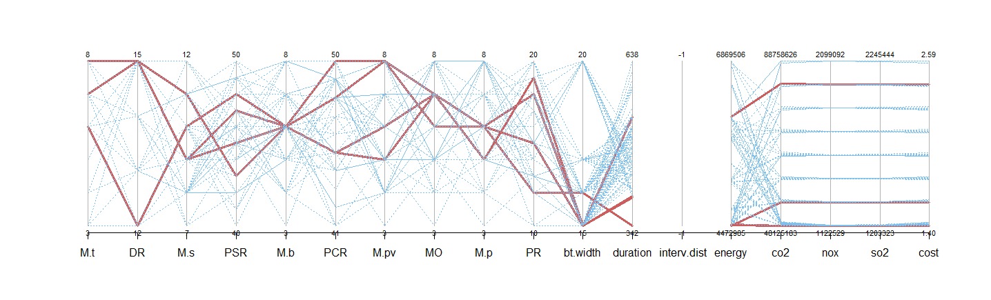
Graph 1
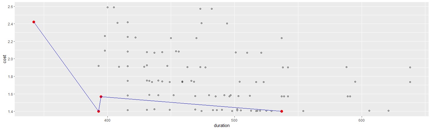
The three graphs below display the state of energy consumption, CO2, and cost during the system’s lifetime, helping to optimize the decision-making process. The red dots in each graph represent the optimal solution. On the other hand, the blue lines connect the optimal solutions and clearly represent the optimal values for each matter. If the designers’ and system preferences on duration of interventions have high priority than energy then the red dot at the left is the optimal one and vice-versa.
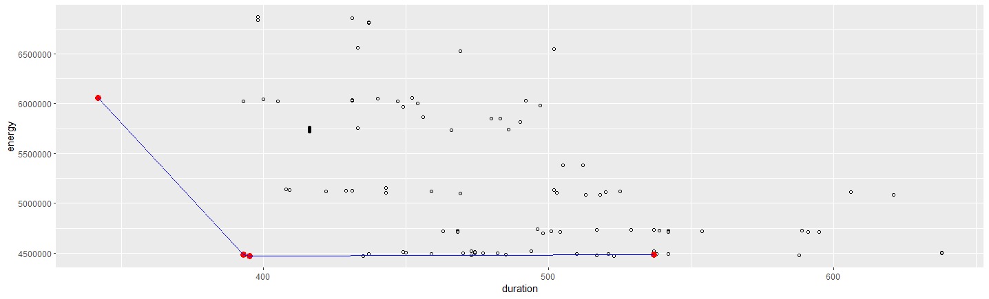
Graph 2 “shows the relationship between energy consumption and duration”
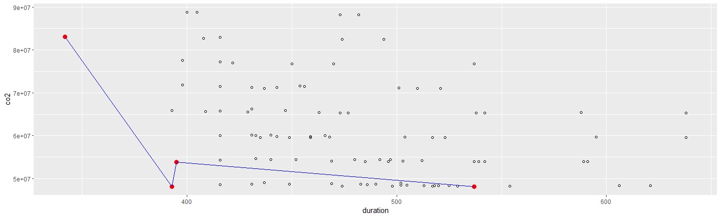
Graph 3 “shows the relationship between CO2 consumption and duration”