Running the genetic algorithm produces a list of 100 entries for the predefined population size of 100 including results for the six output variables (duration of the interventions, the minimum distance between two consecutive interventions, energy, CO2, SO2, and cost).
Extracting the pareto front from the data helps putting the results into context. For that, the pareto front described by the total duration of the intervention and the cost is visualized in the following figure.
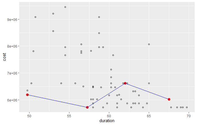
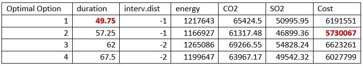
In the graph above, 4 optimal solutions are shown by the red dots, these together representing the pareto front by the blue line. The results of these optimal options are shown in the table below, in which the optimal values for duration and costs are highlighted in red.
To get insights into the effect on the other performance criteria besides duration and cost, the accumulated results of the genetic algorithm are visualized in the following figure.
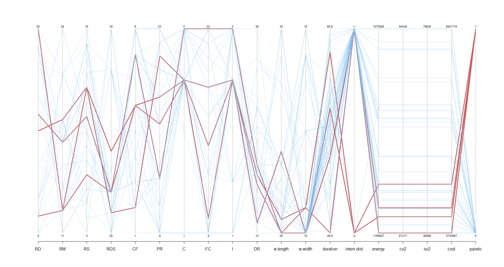
The solutions from the pareto front are displayed as the red lines and the blue lines show the non-optimal solutions. The red lines can be used as a tool for identifying the the optimal solutions’ results as trade-offs. In the following table the results for all the performance criteria of each option are presented, being the optimal values of for each criteria highlighted in red.
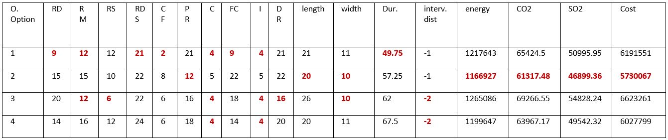
The definition of the most optimal solution can be supported by these results and will depend on the weighting stakeholders define for each perfromance criteria and can be finally defined with the support of a Multi Criteria Decision Method.
Navigation